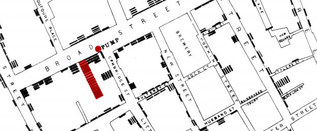
Embedded below is a high resolution version of John Snow’s 1854 map of the Broad Street (now Broadwick Street) cholera outbreak. Widely cited as the one of the first (and arguably best) examples of using spatial analysis in epidemiological studies, Snow’s map holds a special place in the hearts of those using spatial analysis to improve people’s lives.
About the map: I found this map on the UMapper website and am therefore indebted to andreit (Andrei Taraschuk) for uploading it. Each black bar on the map represents a death from cholera and these can be clearly seen to cluster around the pump (red dot). A much more detailed explanation is provided by the UCLA Department for Epidemiology.

So what does a red bar mean?
In this version of the map I think it serves to highlight the location with the greatest number of fatalities.