Another brilliant visualisation from UCL’s CASA, this time from Anil Bawa-Cavia. It visualises trips made on the London Underground using data gathered from Oyster Cards. Each trail is a single trip between a known origin and destination station. Anil has guessed the route in between using a shortest path algorithm. The animation uses a 5% sample of passengers on the network made available as a Transport for London Data Feed.
Anil has also produced a “Flowprint” to show simulated flows of London buses across the 744 routes that make up the network. You can read more here
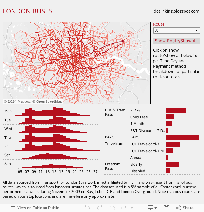
If you are interested in some of the data behind this visualisation Mark Bulling has produced a great interactive graphic.
LONDON BUSES
One comment