This week, thousands of teenagers across the capital will receive GCSE results that will likely have an impact on the life decisions they take over the
More...
Highlighting the best London maps
This week, thousands of teenagers across the capital will receive GCSE results that will likely have an impact on the life decisions they take over the
More...
Aside from the odd rumble of a tube train, or perhaps a burst pipe in winter, Londoners often overlook the goings on beneath their feet.
More...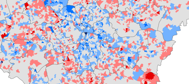
Chris Gale, a fellow UCL Geographer, has produced these maps showing the change in deprivation scores in London between 2007 and 2010. They show a
More...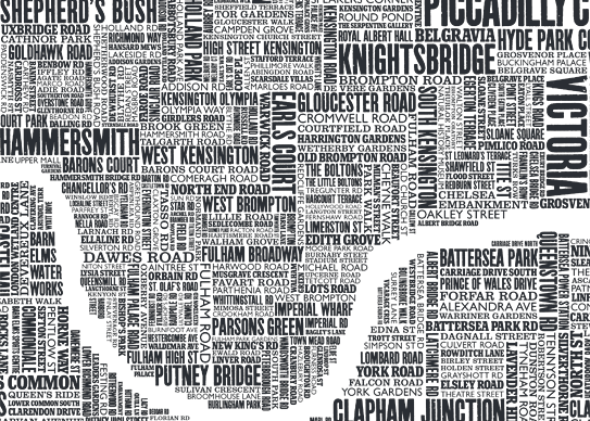
Some of the most popular posts on spatialanalysis are about typographic maps. I thought it would be cool to put together some of my favourite’s
More...
This is another great map animation from our friends in CASA. It is a year old now (almost to the day) but it remains one
More...
Embedded below is a high resolution version of John Snow’s 1854 map of the Broad Street (now Broadwick Street) cholera outbreak. Widely cited as the
More...Another brilliant visualisation from UCL’s CASA, this time from Anil Bawa-Cavia. It visualises trips made on the London Underground using data gathered from Oyster Cards. Each trail is
More...
If you lack a sense of direction and resort to writing directions on scraps of paper or the palm of your hand, this glove is
More...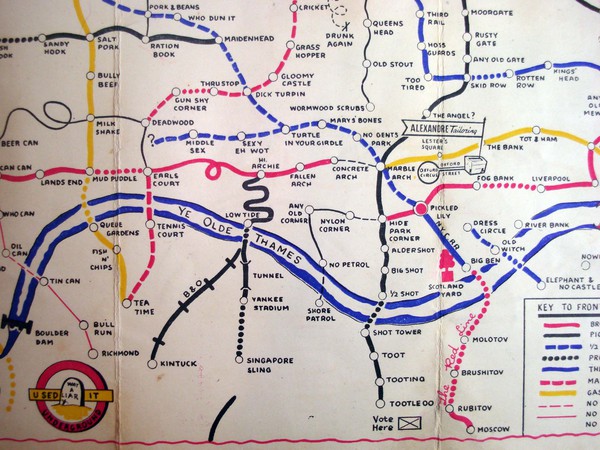
I wanted to steer clear of the iconic London Underground map because it is always featured on map blogs. I have already failed miserably thanks
More...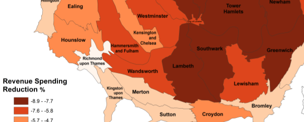
The map is a cartogram showing the level of child poverty for each of London’s councils in addition to their predicted loss in revenue spending
More...
Some of us at CASA can’t get enough of the Barclay’s Cycle Hire data. We have had Ollie‘s hugely successful flow maps, journeytime heat maps, and now the the Sociable Physicist himself,
More...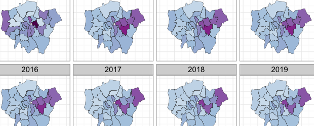
Buried in the London Datastore are the population estimates for each of the London Boroughs between 2001 – 2030. They predict a declining population for most
More...