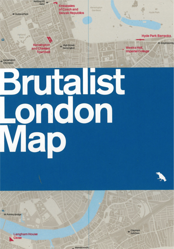
For fans all all things concrete comes this map of London’s most famous Brutalist buildings. Created by Blue Crow Media (see also their craft beer and cycling maps, it is the first in a new series of map-based guides to London architecture, focusing on the modern 1950s/60s “raw” concrete-heavy designs by Le Corbusier and others of the post-war architectural phase.
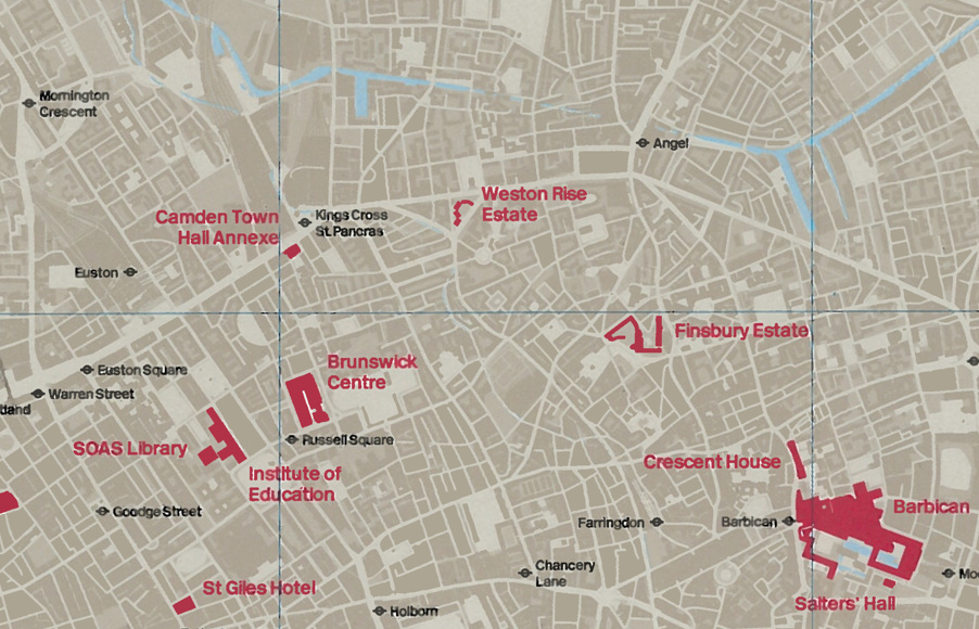
The map is presented attractively in a blue band which keeps it nicely folded. The font used for the map title and building captions is the classic Helvetica font, used most famously on the New York Subway signs, crops up in all kinds of modern design institutions and is entirely appropriate here. On the reverse of the map, once unfolded, there is a short section on each of the structures featured on the map, with a photo, address, designer, build date and listing info. Blue Crow Media have created a soothing, subdued background map of concrete greys, browns and pale blues, using OpenStreetMap data. They have eschewed road names, featuring instead tube and railway stations, denoted (perhaps controversially) by roundels, as the chief geographic landmarking for the map, along with park names. It’s a bold idea but works well here with the partially translucent red for the Brutalist building outlines standing out strongly.
If the Barbican Estate is one of your favourite London places, then this is the map to get to further explore these striking, if divisive, buildings.

Thanks to Blue Crow Media for the review copy.

@biecoilluminist grazie. Nei miei prossimi acquisti c’è questa: https://t.co/XSYNPbsOBu
Brutalist London Map | Mapping London https://t.co/cwKVmDn1d8 via @MapLondon