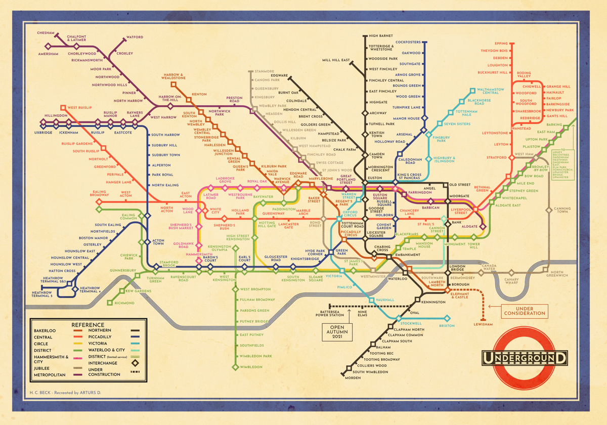

This creation by Arturs D, a volunteer at the London Transport Museum, is a faithful transplantion of the original c.1933 H.C. “Harry” Beck London tube map, the first to show the network as a diagram with rigid lines and corners – to the modern day network. The official Transport for London map is itself the modern successor to the Beck original, however over time it has evolved in design – from the coloured diamond interchanges being replaced with black circles, to the increasing clutter of adding several non-tube networks (DLR, Trams, TfL-managed heavy rail and now riverbus stops), station note “daggers” and accessibility markers.
So, taking this step back to the simple, revolutionary “circuit board” design, but incorporating the changes to the tube itself, is a breath of fresh air. Arturs has taken great care to keep the original look and feel of the 1933 map, with its varying colours and some cartographic inconsistencies. Sure, you could fix these, but then it wouldn’t be a homage to the original, and the temptation to over-detail would be there.
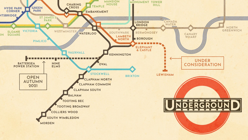
The “Under Consideration” for the proposed extension of the Bakerloo line is a nice touch, and the Northern Line extension is included too – again, both echoing the style of the original.
The distinctive overall tone produces something which the modern traveller can use while giving it an instant vintage “wall art” appeal too. How brilliant would it be if TfL released this as one of their “official” maps?
You can find out more about the map on Arturs’ Twitter account or at Gumroad where a high-resolution version is available for download for an optional donation.
Discovered on Londonist. Design copyright Arturs D, based on an original which is copyright Transport for London.
The Original Beck Map with the Modern Network — https://t.co/2KPz5XZVE7
The Original Beck Map with the Modern Network https://t.co/7DgI6vxetG
I’ve owned a copy of “Mr Beck’sUnderground Map: a History” for over two decades, but now that I’ve actually moved to London, I have to say the distortions in geography make it a terrible map. I work at Holborn, and the map completely misrepresents what stations are close by. The “London Connections” map you forced them to release under FOI is far superior in my opinion and I keep a copy on my phone and tablet for reference.
https://mappinglondon.co.uk/2015/geographictube
RT @MapLondon: Modern map of the London Underground by @DerpyScripts that sticks strictly to the style of the 1933 “Beck” original. Both co…
RT @MapLondon: Modern map of the London Underground by @DerpyScripts that sticks strictly to the style of the 1933 “Beck” original. Both co…
RT @MapLondon: Modern map of the London Underground by @DerpyScripts that sticks strictly to the style of the 1933 “Beck” original. Both co…
RT @MapLondon: Modern map of the London Underground by @DerpyScripts that sticks strictly to the style of the 1933 “Beck” original. Both co…
RT @MapLondon: Modern map of the London Underground by @DerpyScripts that sticks strictly to the style of the 1933 “Beck” original. Both co…
RT @MapLondon: Modern map of the London Underground by @DerpyScripts that sticks strictly to the style of the 1933 “Beck” original. Both co…
RT @MapLondon: Modern map of the London Underground by @DerpyScripts that sticks strictly to the style of the 1933 “Beck” original. Both co…
RT @MapLondon: Modern map of the London Underground by @DerpyScripts that sticks strictly to the style of the 1933 “Beck” original. Both co…
RT @MapLondon: Modern map of the London Underground by @DerpyScripts that sticks strictly to the style of the 1933 “Beck” original. Both co…
London’s modern underground network, in the 1930s H.C. Beck style https://t.co/5Nd1TN7fwU
RT @MapLondon: Modern map of the London Underground by @DerpyScripts that sticks strictly to the style of the 1933 “Beck” original. Both co…
The Original Beck #Map with the Modern #London Underground Network https://t.co/igKgIsatBL
Is there any intention of your publising A1 or A2 printed copies of this excellent map?