The Tube Map is a design classic – the straight lines, even spacing and lack of unnecessary above-ground detail has become a hall-mark of metro maps across the world, since it was first drawn by H.C. Beck in the 1930s. Today, the printed versions of London’s tube map include a specific acknowledgement of the creator of the concept, even as the map itself has greatly expanded with the addition of a many new services. However, there was a period of time, between the merging together of various rival networks in central London at the beginning of the 20th century, and the creation of the Beck tube map, when cartographers attempted to show the crowded and complex network in different, but geographically-focused, ways.
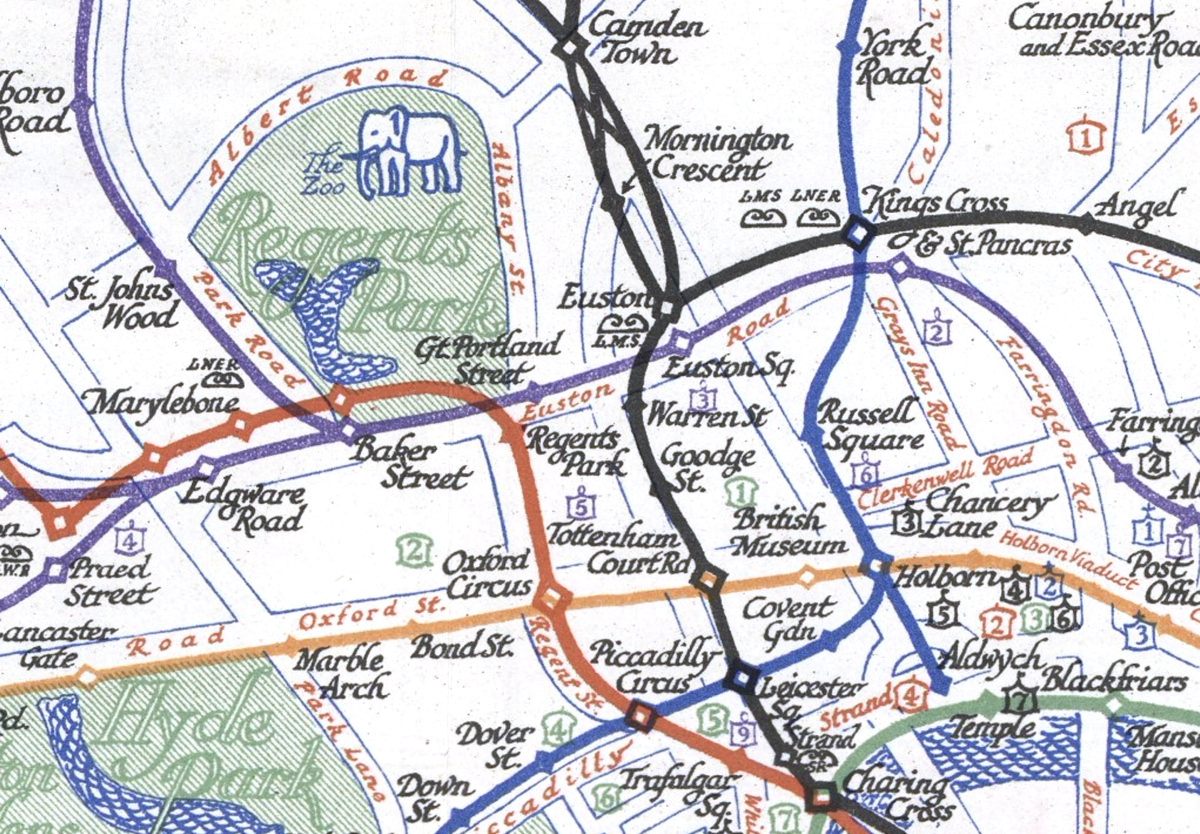
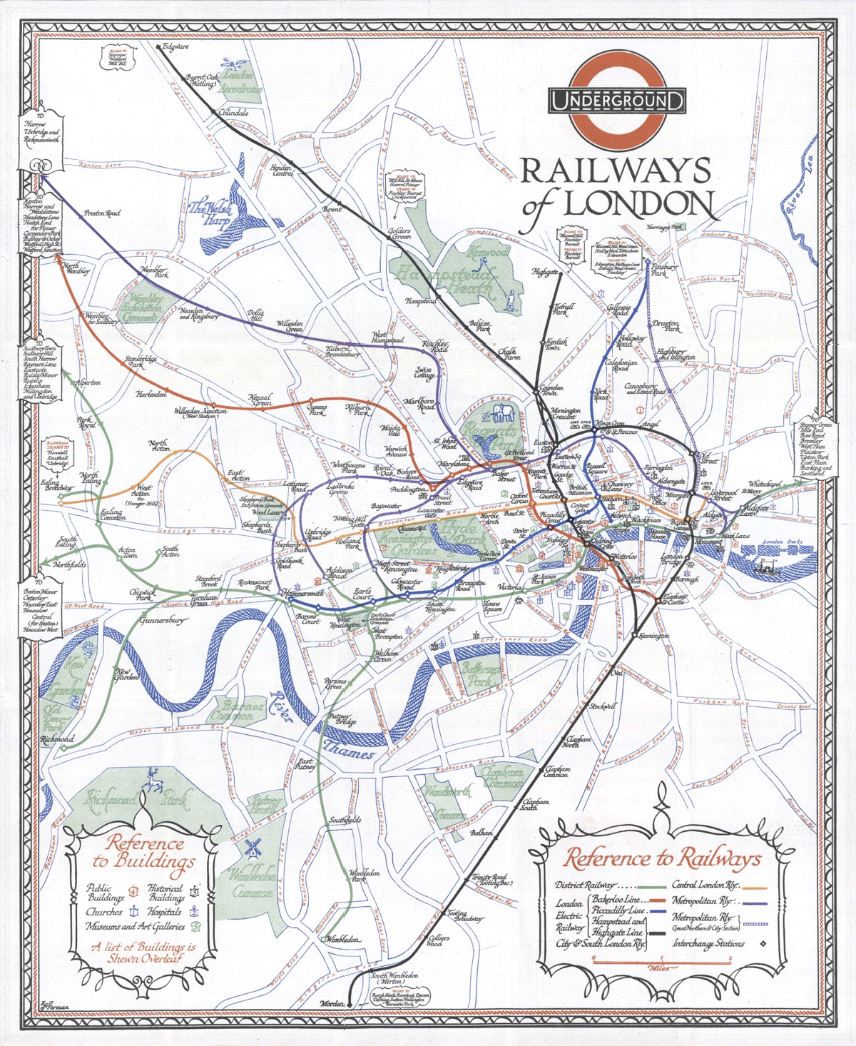
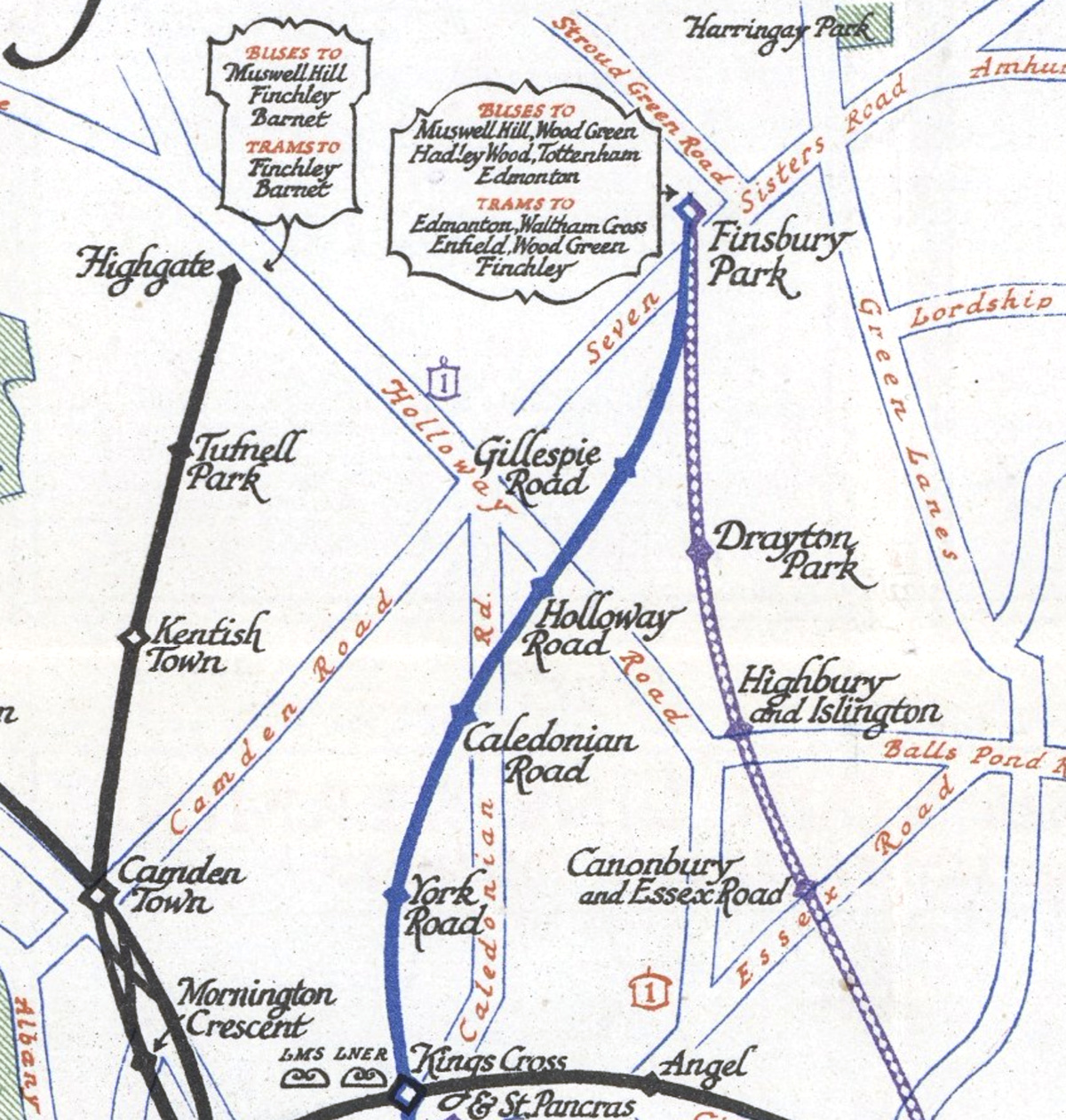
This map, by E.G. Perman, and available in the David Rumsey Map Collection, was one of the last maps produced, of London’s tube network, before the Beck “revolution” of the 1930s. It was drawn in 1927 and issued the following year, and shows some network simplifications – the lines between stations are shown with simple, gentle curves, rather than capturing the actual wiggles of the network. Stations are shown as small filled diamonds for regular stations, and larger, hollow diamonds for larger ones – when these are overlaid, due to the different colours of the different lines, there is some indication of the connection. Interestingly, and surprisingly, the complex crossovers of the Northern Line, just south of Camden Town, are shown on the map. Connections with mainline rail are shown beside the relevant station with small curly lines, with the operator name written just below them in a smaller text.
This being a 1920s map, the classic “flowery” touches are present, such as the sweeping serifs of the font, waves on the water features, and the ornate map border.
The most impressive feat of the map is showing the tube network geographically, plus the major streets of central London, the Thames, parks and tourist attractions, while not making the map overly crowded. There’s even enough room to draw an elephant at the Zoo, the windmill in Wimbledon Common, a stag in Richmond Park, a steamer on the Thames and so on – just enough illustration to benefit the map and not overwhelm it. Bus links are shown at the end of several lines. Some of the longer lines are also truncated with the farther out stations simply indicated as a list. Tourist attractions are indicated with colour coded and numbered symbols (the back of the map detailed these).

They don’t make tube maps like they used to – a simple pure geographical map of the tube is not easy to read – but I reckon that if a tube map was made in this style, today, it could still work as something functional and informative, while also being attractive and representative. Many Londoners and visitors rely on the modern tube map as their main reference map of London, and it’s a shame if they never see how everything above ground joins together, as is effectively shown on this 90-year-old map.
The imagery is from the David Rumsey Map Collection and is Copyright © Cartography Associates 2018.
Underground Railways of London, 1928 — https://t.co/qHRtzfS9bk
“This being a 1920s map, the classic “flowery” touches are present, such as the sweeping serifs of the font, waves… https://t.co/gbqrimCFDs