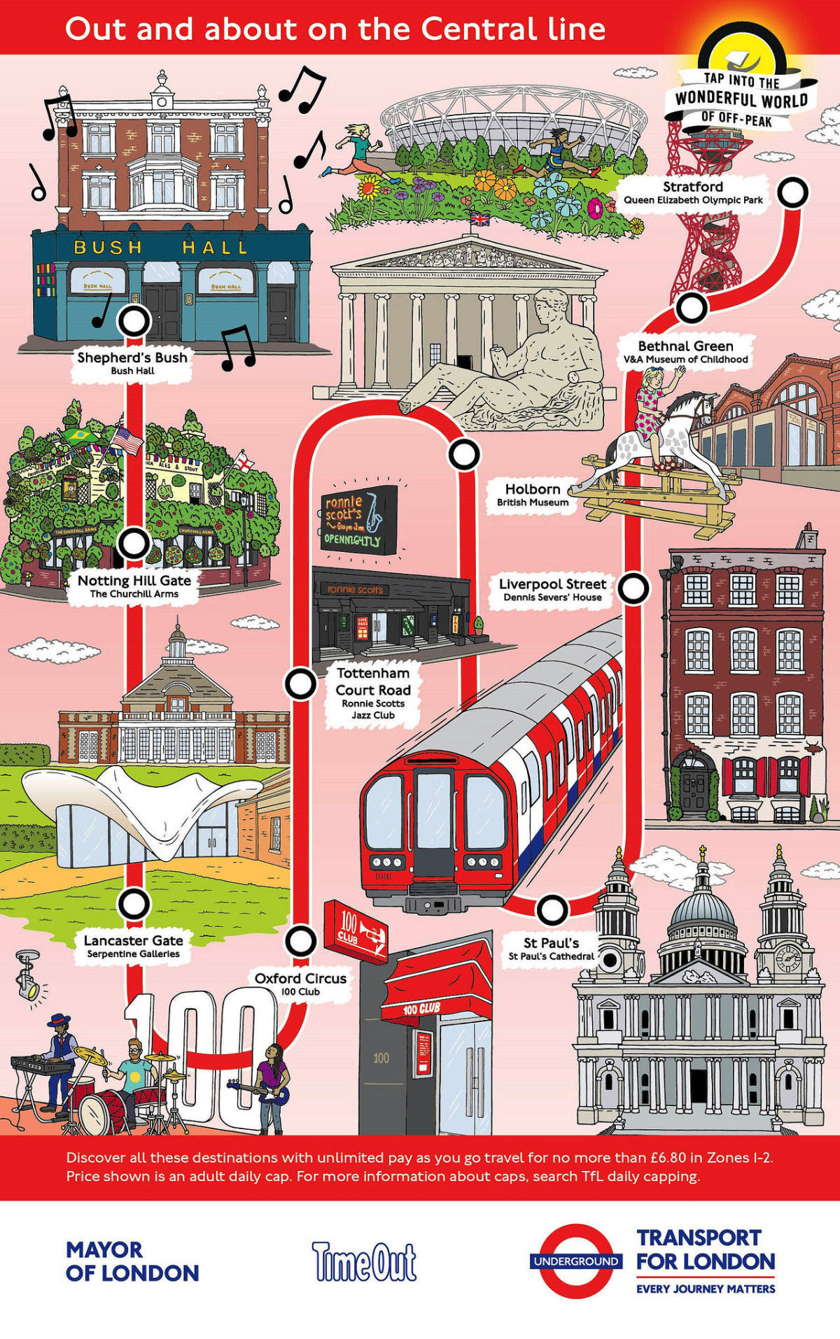

TfL is keen to get people travelling on the tube when it’s not so busy, and also beyond Zone 1. With this in mind, they’ve commissioned these line maps, in conjunction with Time Out magazine. Each line (except the Waterloo and City) gets one, with the most interesting sections of each line converted into a “wiggle” map, surrounded by various tube-accessible tourist attractions. There’s one for the London Overground too, although it doesn’t help unravel what connects to what on the line – mind you, the official London Overground map is a bit of a headache too.
You can see all the maps on this TfL Flickr page. Each poster is coloured by its line, and generally includes the type of tube train that runs on that line, drawn somewhere on the map amongst the tourist attractions – a nice touch.
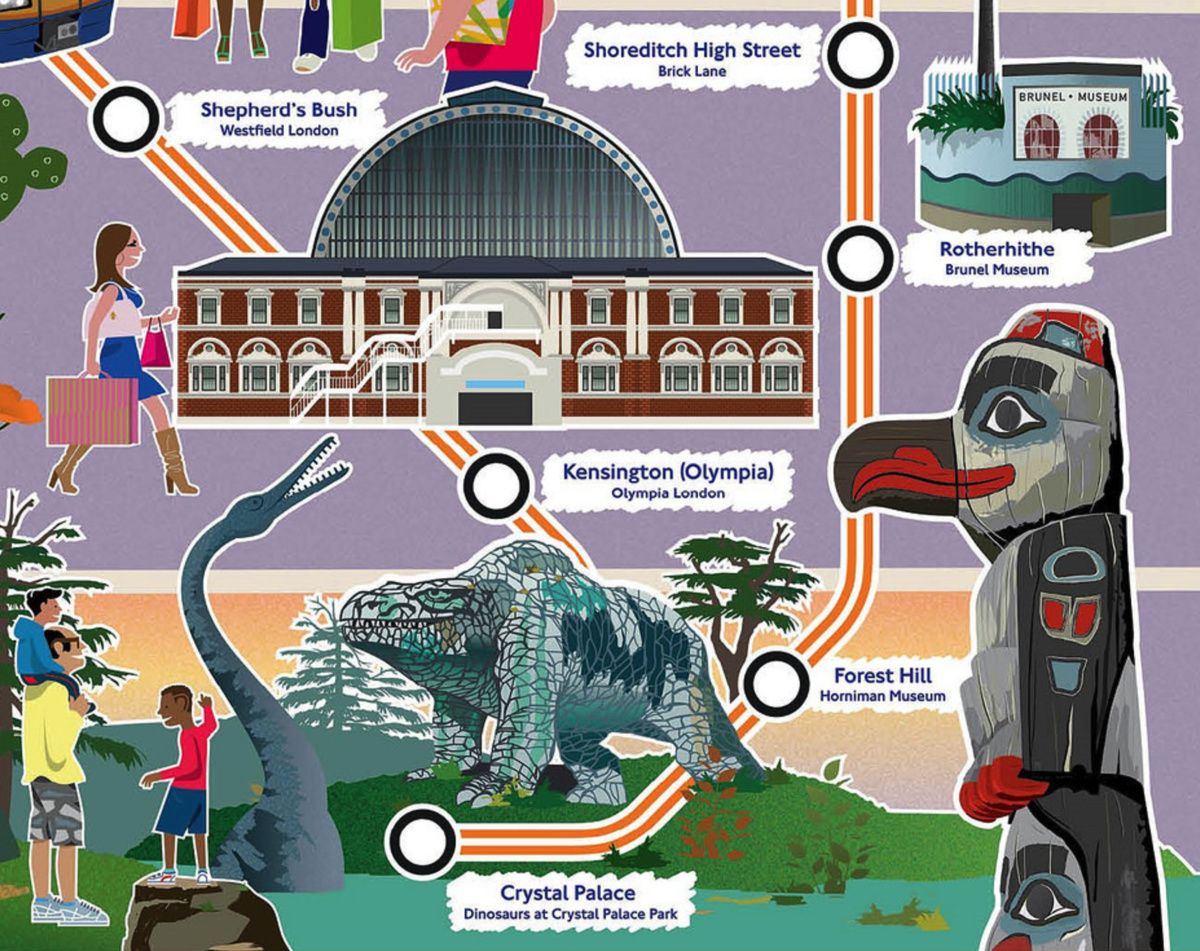
There’s a lot of artistic licence applied to the drawings – for example, the dinosaurs above are serious sexed up compared to their concrete versions that do however indeed appear in Crystal Palace park. You should still go and see them though, if you never have!
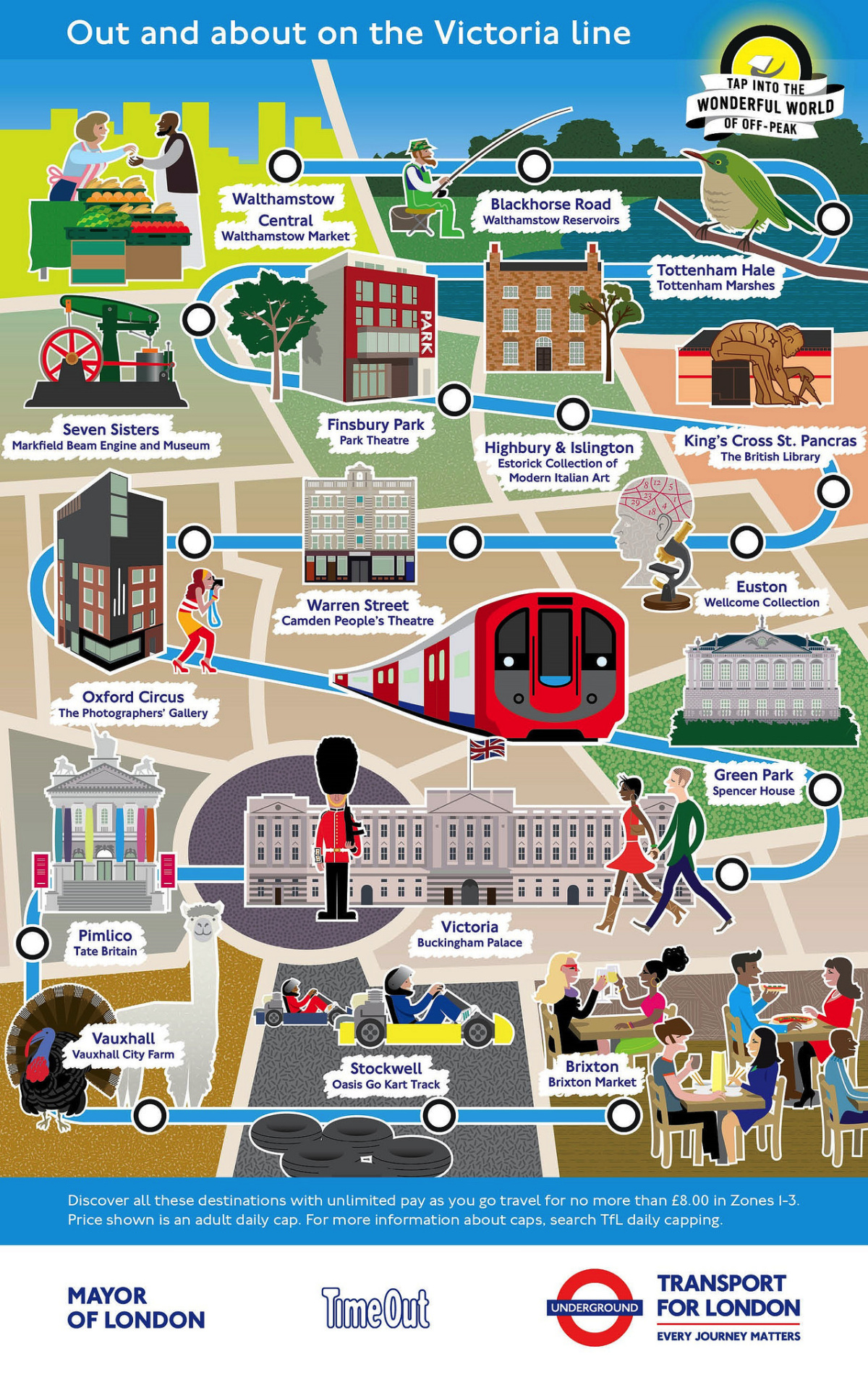
The line maps tend to not show stations that don’t have anything particularly interesting near them, and the outer ends of the longer lines are also generally missed out. However, the Victoria line (see below) has its full length shown, with things to do at every tube stop. I always knew the Victoria line was the best.
The campaign launches officially on Friday so expect to see these posters appearing at various tube stations and in Time Out.
Thanks to Diamond Geezer for the tip-off.
The Wonderful World of Off-Peak — https://t.co/zTh17R9e6Y
The Wonderful World of Off-Peak https://t.co/FOYmSkGF7t
The Overground train in the corner looks like class 710, which isn’t yet on the Overground now, half a year later.
No, it’s a 378 – yellow front. The 710s, when they finally sort them out, have orange fronts.