
A series of blue cycle lanes, branded signs, junction reprofiles and street furniture changes are gradually being built, creating a “hub and spoke” type network of fast cycle routes from inner/outer London into the centre. These are the Barclays Cycle Superhighways. Two are complete, with two being constructed this spring. More might follow next year.
Transport for London has created “line maps” for each of the routes, available as PDFs to download. I like the concept of representing each route as a straight line – the routes themselves are indeed largely linear, being designed for commuters and other “utility users” of bikes that travel longer distances. I’m not convinced a “tube style” map will ever work for cycling, because of the need to represent the genuine distances between features.
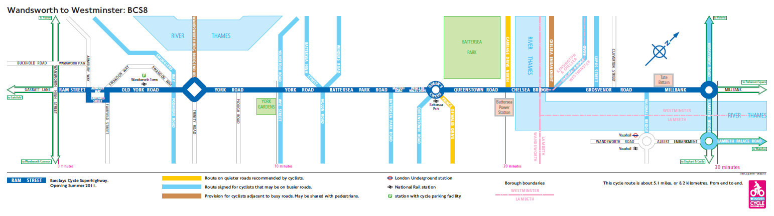
Looking at the map for route CS8, which will run north-eastwards from Wandsworth to Westminster, I like the way that key features are shown as simple squares – Battersea Park, Battersea Power Station and Tate Britain. Continuation routes are suggested at either end. Road names (not road numbers) are featured prominently. These are what you see on the bike. Pink isochrone lines show estimated times, e.g. 10 minutes from York Gardens to Battersea Power Station. The only problem with the map is where the route does turn right or left at a junction, with another road carrying straight on. You would be hard pressed to spot this from the map, so hopefully the signage on the ground will be particularly prominent at such junctions. In the case of CS8, this occurs at the Queen’s Circus roundabout, where a nearly 90-degree turn is needed to stay on the route.
“…with two being constructed this string”
should be?
“…with two being constructed this Spring”
(welcome to delete this comment afterwards)
just corrected, thanks!
I’m surprised that you praise these maps that are so useless. What one needs, when planning a trip, is a drawing of the routes on a standard map, like an overlay in google maps for example.
I agree, these style of maps are elegantly simple for the tube, but thats because you are not driving the tube, nor do you need to select which turns to take. On a bike, I’d say line drawings are so lacking in information as to be useless to the cyclist who does not already know the route, in which case begging the question of ‘why have a map?’