The fifth book in a series by author/cartographer David Fathers, Diverse London takes forward the four previous books (three with a rivers theme and one
More...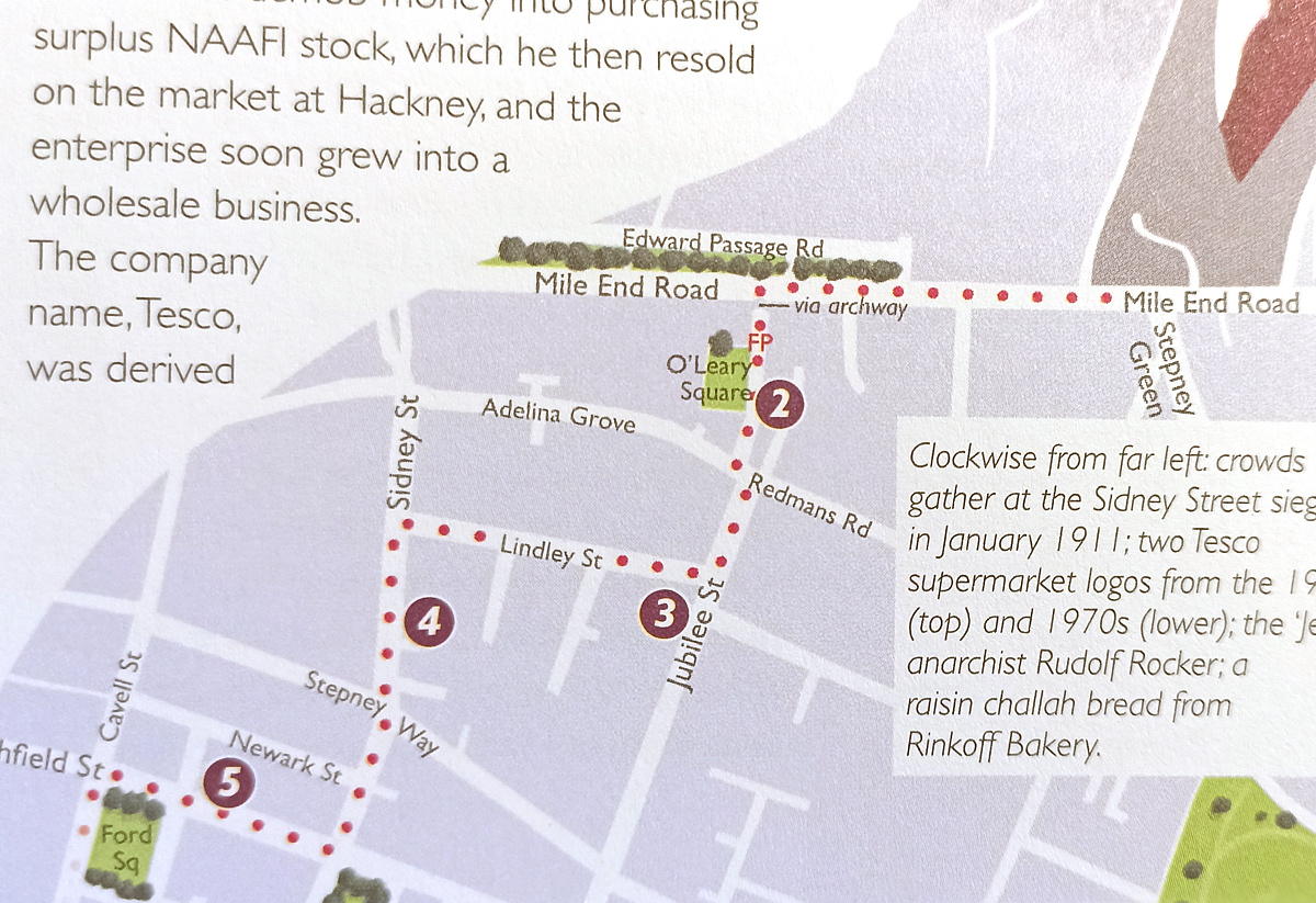
Highlighting the best London maps
The fifth book in a series by author/cartographer David Fathers, Diverse London takes forward the four previous books (three with a rivers theme and one
More...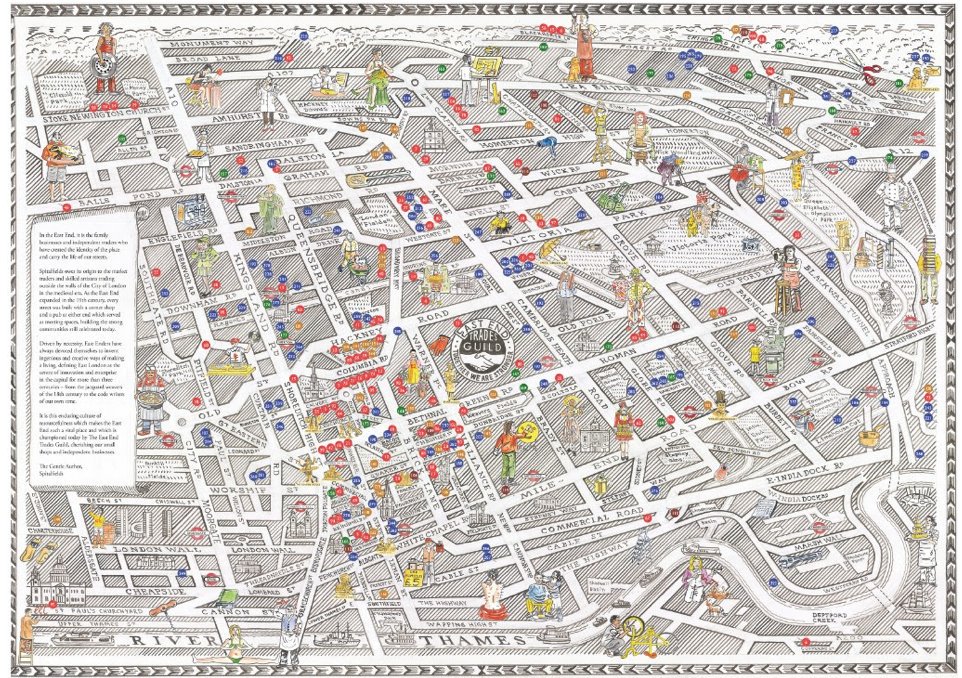
This lovely map, hand-created by artist-cartographer Adam Dant, which was commissioned by the East End Trades Guild, is launched today at their Christmas takeover of
More...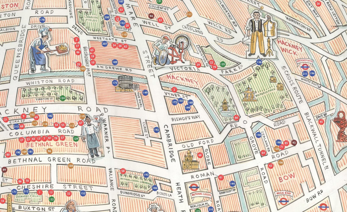
This hand-sketched map has been produced by Adam Dant and Herb Lester, for the East End Trades Guild, to promote over 200 small businesses based
More...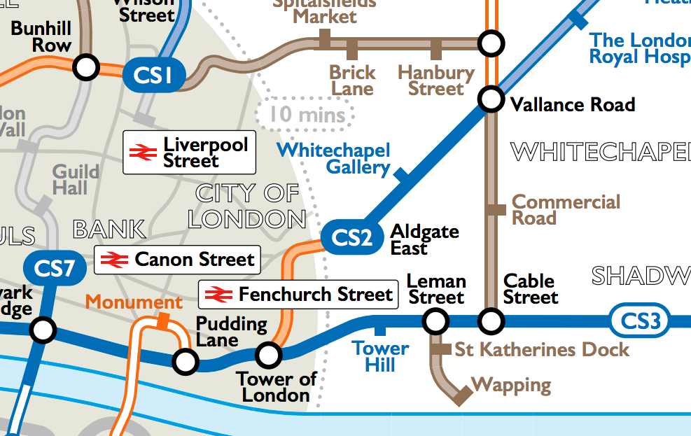
Cycling in London is on the increase, however it can be tricky to discover the best routes for cycling in London – the ones that
More...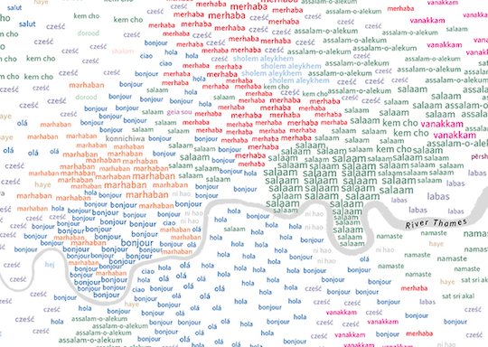
London boasts over 300 different spoken languages – more than any other city in the world. The capital’s lingua franca, of course, remains English: 78%
More...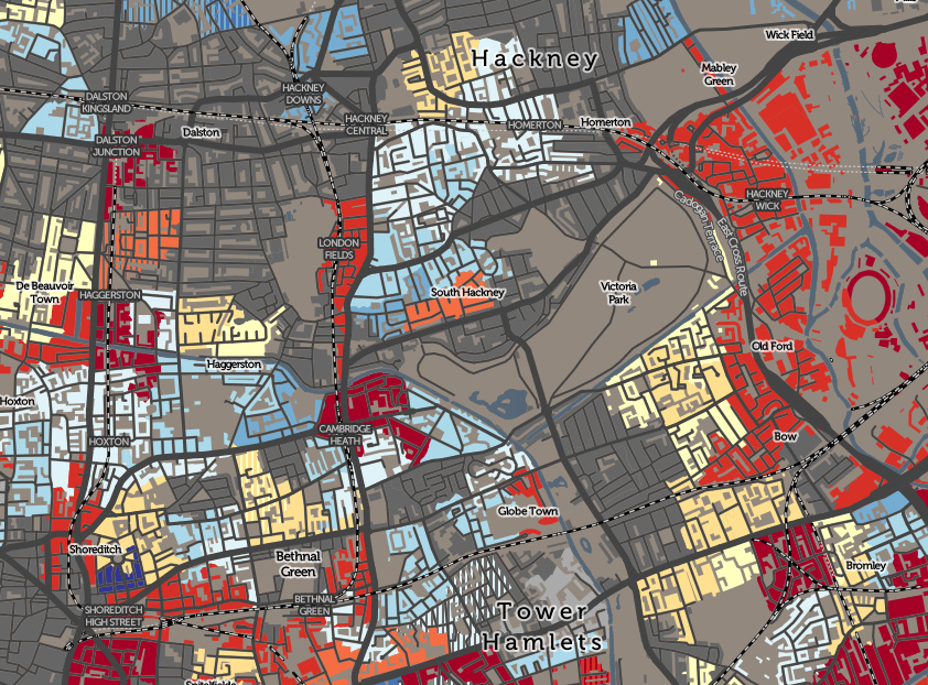
The Valuation Office Agency publish some interesting open data sets from time-to-time. One that caught my eye recently was a breakdown of counts of residential
More...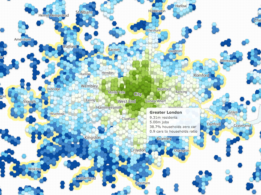
Luminocity3D, an “urban density and dynamics explorer”, is a interactive mapping website developed by UCL CASA’s Duncan Smith, which shows a number of urban demographics
More...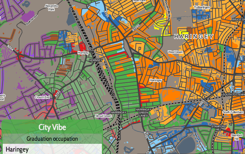
Today, a new version of the Greater London Authority (GLA)’s London Datastore launches, with an updated look, a new responsive data dashboard, and various new
More...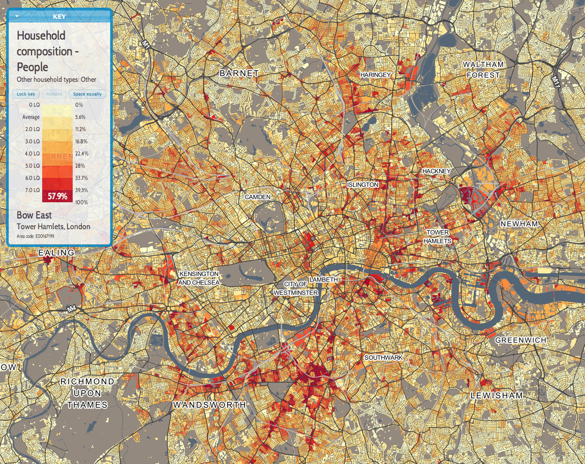
This is the first of a few maps that we will feature over the next few months, that use the new DataShine mapping platform developed
More...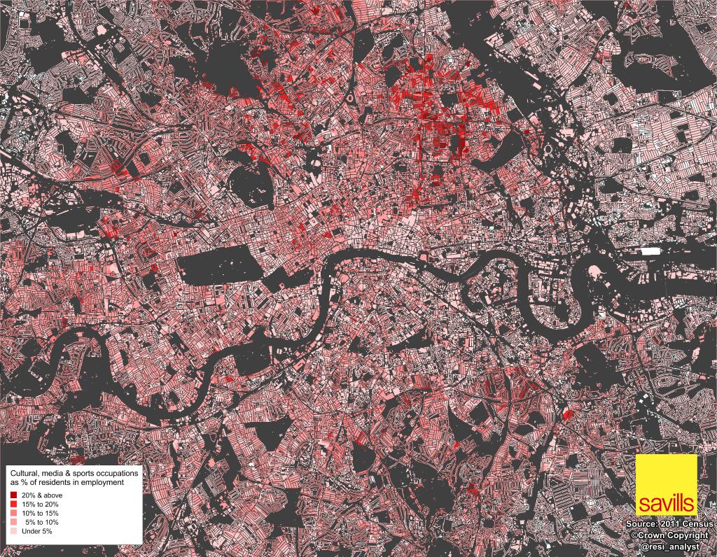
Neal Hudson, housing market analyst at Savills, has been crunching, mapping and graphing interesting results from the 2011 census, since the data started to be
More...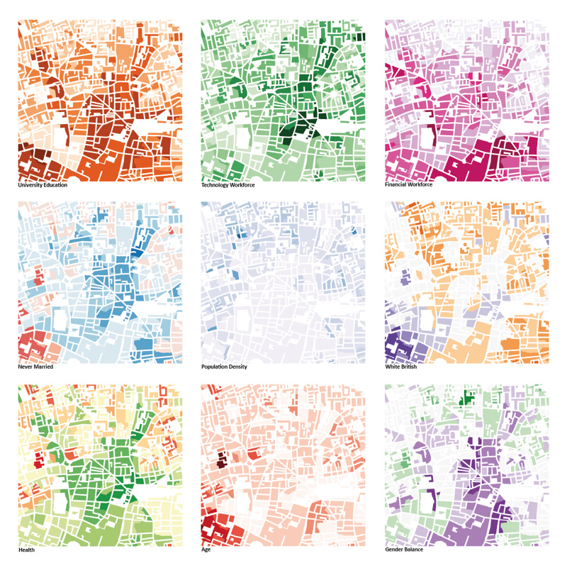
This was the submission by the Mapping London editors into the 10×10 Drawing the City London 2013 art event, which was a charity auction run
More...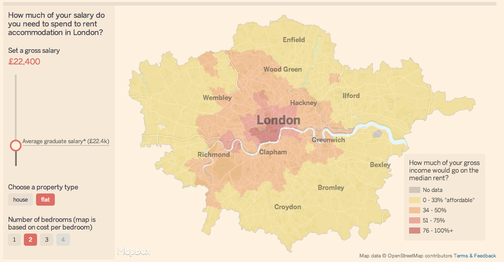
There is always interest in London’s astronomical rents and house prices. As with any global city, there is huge demand for somewhere to live in
More...