
[Updated with additional technical detail – see below]
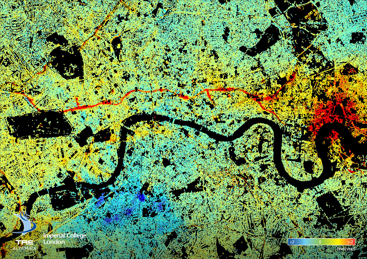
Here’s a fascinating data map of ground deformation (subsidence, upswelling) in central London, based on data from 2011-2017 and recalibrated to show the average annual change – be it rising (blue = 2mm/year upwards) or sinking (red = 2mm/year downwards). The data was obtained from 150 remote sensing images captured by the TerraSAR-X satellite and other InSAR (Interferometric Synthetic Aperture Radar) sources. It was processed using at TRE ALTAMIRA in Milan, Italy, using a technique called Permanent Scatterer Interferometry.
All sorts of interesting patterns appear from the map. The most obvious is the red line running across the middle – the Crossrail tunnels across central London. The project has likely resulted in the slight drop in levels seen, although extensive compensation grouting has aimed to minimise the changes. Other red lines show electrical ducting projects and other utilities/infrastructure projects. Conversely, a large blue area near the south edge of the map might be early premptive groundwork on the Northern line Underground extension to Battersea Power Station, and the extensive residential works at Battersea Power Station (which is right at river/sea level) and the Vauxhall area in general. The specific reason however is not known.
The large red area to the east could be two projects – various residential and other construction around the O2 Arena in North Greenwich, and the various works on the north bank opposite – London City Island, Limmo Peninsula shaft for Crossrail tunnelling works, and general residential tower development at Canning Town. This area has the River Lea running through it with dramatic meanders. The dewatering of deep chalk aquifer here, necessary to stabilise the ground, has seen a significant drop. Also, crucially, there were no buildings here before, so ground level changes have not needed to be carefully controlled as they need to be when working near existing structures.
Some other stories are a little harder to spot – new trees being planted in West Ham Park, or events being held here that have caused the ground to change level? Presenting as a map like this with a simple spectral colour ramp is an effective and clear way of communicating data in a way that tells a story, even if all the patterns cannot immediately be explained.
Thank you to Christine Bischoff at Imperial College for preparing and supplying the map and technical information, more of which is included verbatim below.
Background on InSAR
InSAR (Interferometric Synthetic Aperture Radar) is a remote sensing tool that provides reliable ground surface displacement measurements. Greater London is an ideal area to demonstrate the capabilities of InSAR monitoring. London’s continuous urban fabric as well as regular acquisition of SAR images from high resolution sensors, such as TerraSAR-X, allow monitoring over 1.7 million measurement points with millimetre-scale accuracy.
The data presented here were processed using an advanced InSAR technique called SqueeSARTM (2011 Ferretti et al.) at TRE ALTAMIRA, Milan, Italy. The SqueeSARTM algorithm is unique in providing a high spatial density of reliable measurements, even over rural areas or parkland, rather than just over urban areas. A detailed description and explanation of the SqueeSARTM technique can be found in 2011 Ferretti et al.
The majority of measurement points shown in the following figures are so-called permanent scatterers (PS). These are ground objects which reflect radar waves in a way that is stable over time, i.e. the object’s radar return does not lose coherence (2014 Ferretti). Amplitude and phase information are recorded for each radar image; any change in or movement of the PS position will result in a phase shift of the radar return between an image acquired before and one acquired after the movement (2014 Ferretti). After filtering out noise, topographic and atmospheric effects, this phase shift can be translated into a displacement in the Line of Sight (LOS) of the sensor, providing measurements of ground movement at mm-scale accuracy.
The data presented here is based on 150 images, acquired by an X-band (wavelength 3.1 mm) sensor mounted on a satellite called TerraSAR-X, which were acquired in regular, usually 11 day intervals between 01.05.2011 and 28.04.2017. The dataset contains, on average, 1482.1 measurement points per km2 in an area of over 650 km2. All displacement values referred to in this article are in the Line of Sight (LoS) of the sensor, which in this case means at an incidence angle of 37.33°.
Full Caption for Map
This is a ground deformation map of London retrieved from 150 radar satellite images acquired between 01.05.2011 and 28.04.2017 using Permanent Scatterer Interferometry (SqueeSARTM).The data were processed at TRE ALTAMIRA, Milan. Red corresponds to subsidence and blue to uplift (-2 to 2 mm/year), while black areas are mostly parks and the Thames, where no measurement points can be retrieved. Although most of London is stable, some zones are notably moving. The conspicuous red line meandering East-West is subsidence caused by the tunnelling for Crossrail and the red blob just East of Canary Wharf is caused by dewatering of the deep Chalk aquifer, which was necessary for Crossrail’s construction in East London. The areas of uplift (blue) found South of the Thames are yet to be explained.
InSAR Ground Deformation Map — https://t.co/LTESuTrhUa
interesting map, but what is the datum against which all the points are measured?
I’ve updated the post to include all the technical detail I have available. I presume that a datum is the ground levels at the beginning of the measuring, that is, mid-2011. The map shows the changes since then, for each location, rather than any values w.r.t a spatially-uniform zero point.