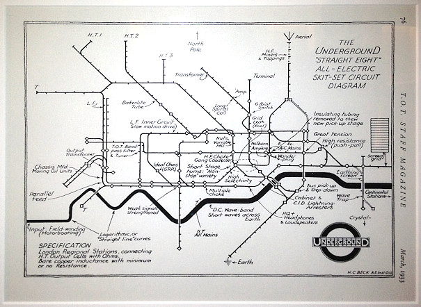
A major new exhibition on mapping the London Underground – Mind the Map – opened last week at the Transport Museum in Covent Garden. Mapping London was at the launch and got to look at a huge collection of maps of and about the London Underground. We’ll be featuring some of our favourite maps from the exhibition over the next few weeks. Apologies to all those who already think we feature too many tube maps, there are plenty more on the way!
Here’s one of my favourites from the exhibition. When Harry Beck drew his iconic London Underground network map in 1932, full of straight lines and spatial distortions, it was not met with a universally positive reception. Some colleagues at London Transport complained that it looked too much like an electric circuit diagram rather than a geographical map. As if to acknowledge this, Beck drew, as a joke, a version of his map adopting many of the standard electrical components found on a geniune circuit diagram. An aerial and earth appears, and the Bakerloo line becomes “Bakerlite”. The map appeared in London Transport’s internal staff magazine in 1933.


2 comments