Eric Fischer produced this interesting data map of London a while back. The map is entirely made of of location coordinates included on Twitter tweets,
More...
Highlighting the best London maps
Eric Fischer produced this interesting data map of London a while back. The map is entirely made of of location coordinates included on Twitter tweets,
More...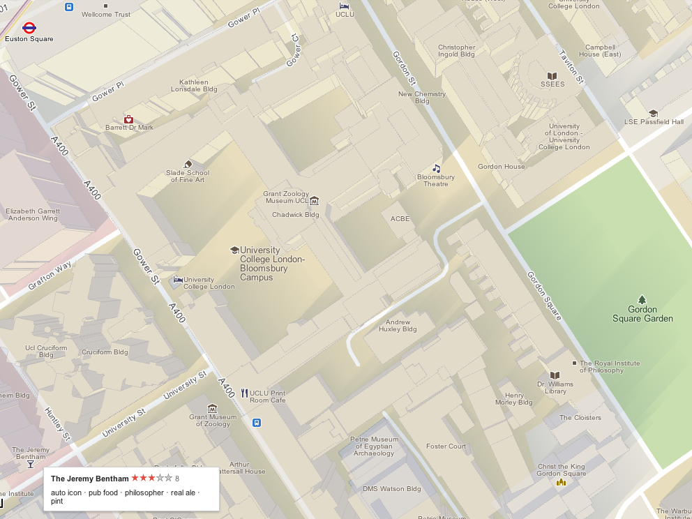
The Mapping London blog is 1 year today! We launched on February 24, 2011. To celebrate, today we are featuring Google Maps, and how it
More...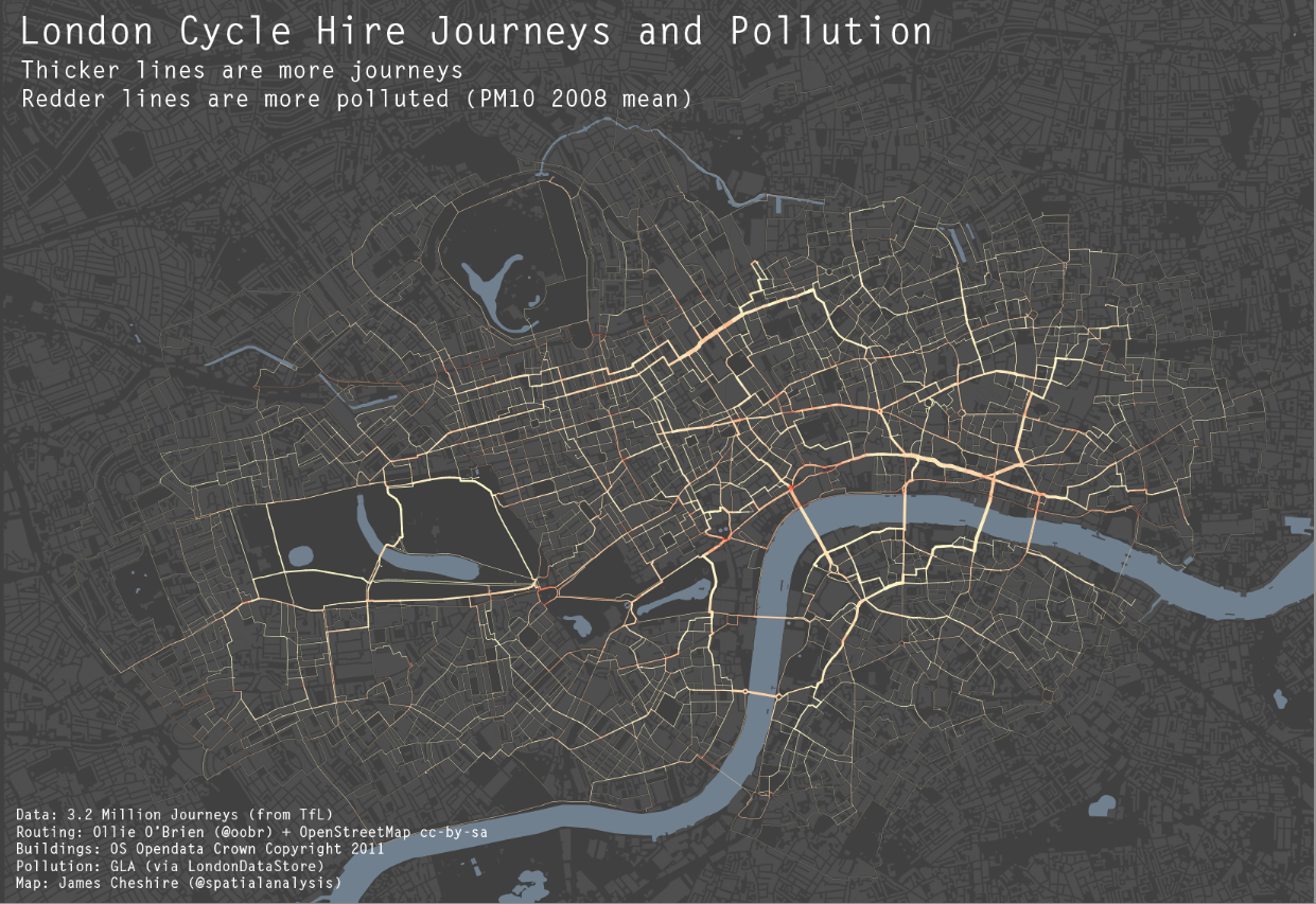
As a cyclist in London you can do your best to avoid left turning buses and dozy pedestrians. One thing you can’t really avoid though
More...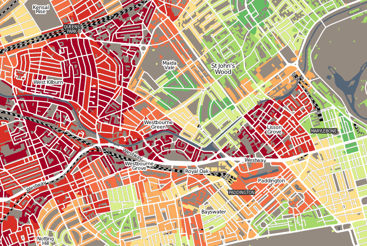
“Geodemographics of Housing in Great Britain – a new visualisation in the style of Charles Booth’s map” is a map that I have produced that
More...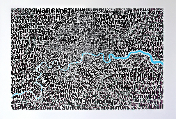
James previously featured a tube map made up of just names of the stations. He’s also featured other London typographic maps. Exploring a little further,
More...