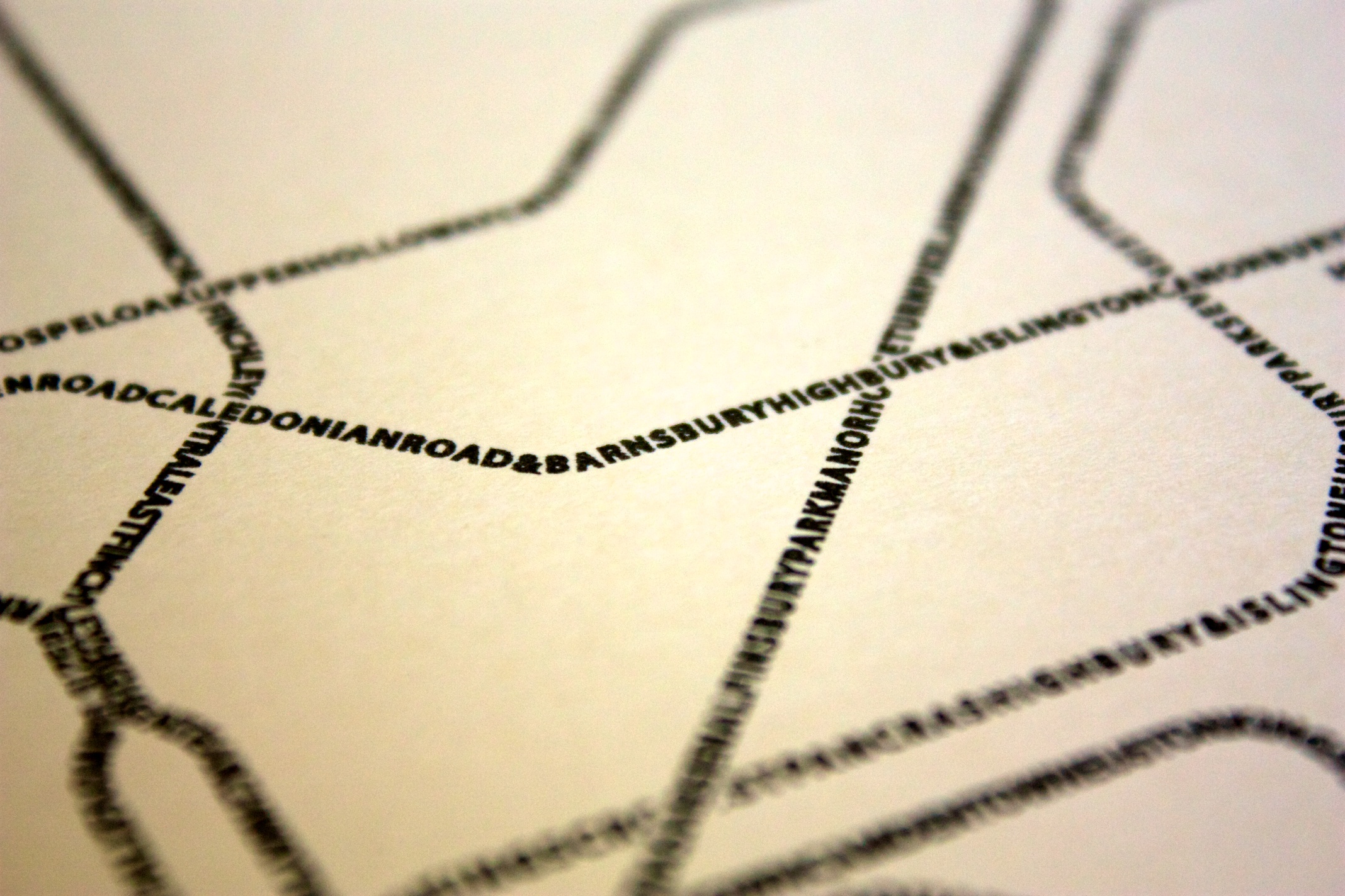
This* splendid typographic London Underground map arrived in the mappinglondon post tray this morning. Scott at Fadeout Design has simply replaced the track lines with the station names.
From a distance it looks like a charcoal sketch of Beck’s iconic design, but close up it has loads of detail. As with all great designs this map understates the amount of work that must have gone into it. It is printed on high quality paper if you want to just stick it to a wall but I recommend framing. That is where I am going in my lunch break…
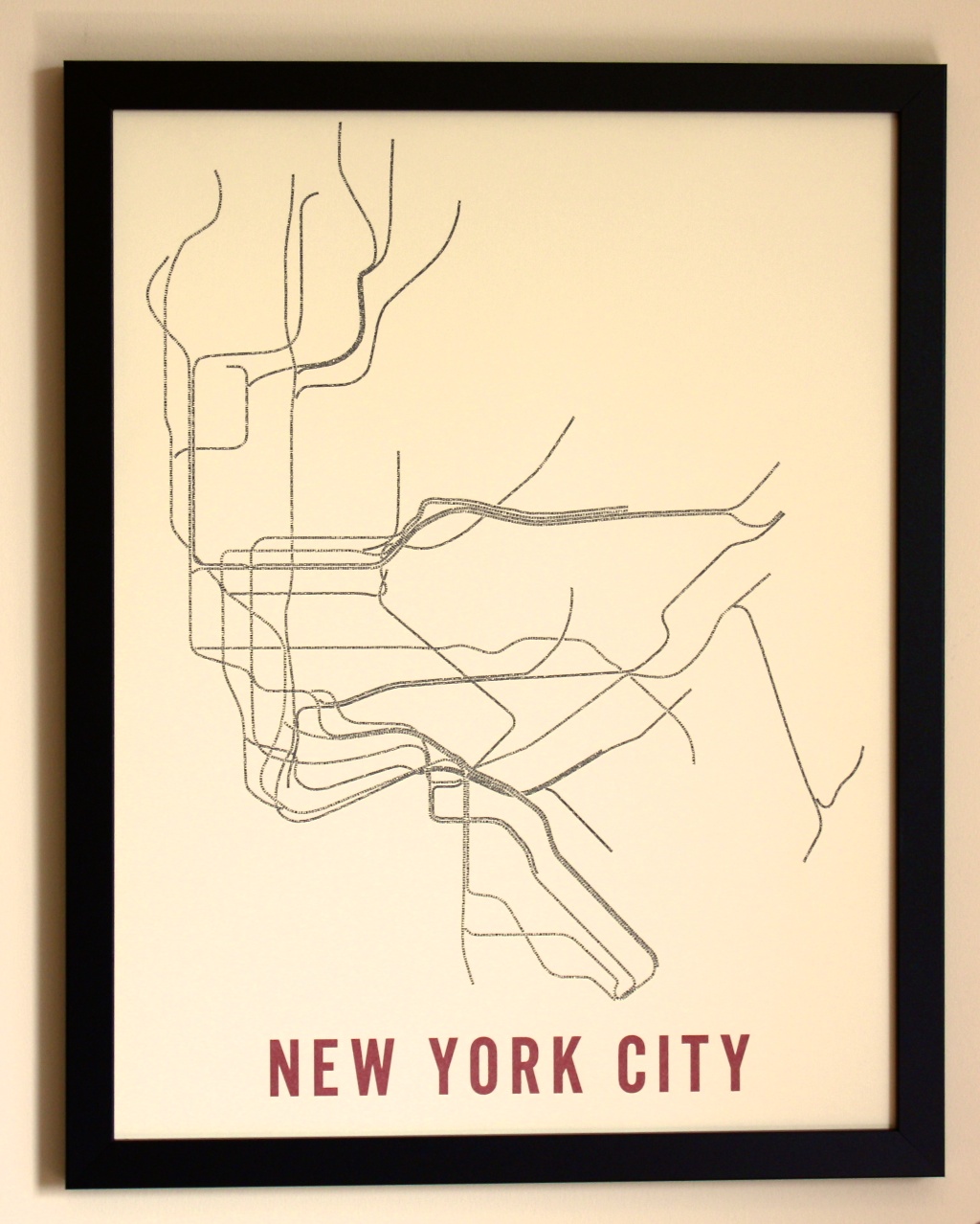
Check out the Fadeout Design website for map of New York (below), Boston, Chicago and a few other US cities.
*the pictures are from Scott’s website, my attempts to take a picture of the map I have didn’t do it justice.


2 comments