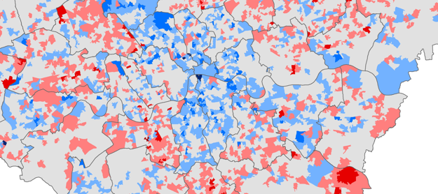

Chris Gale, a fellow UCL Geographer, has produced these maps showing the change in deprivation scores in London between 2007 and 2010. They show a measure called the Index of Multiple Deprivation which ranks areas nationally according to how “deprived” they are. According to an area’s rank it is assigned a score that gives an indication of its levels of deprivation. How you define “deprivation” is obviously subject to debate and the index is not particularly straightforward to calculate. Nevertheless the measure is widely used by government, industry, and academia so it is useful to know how where you live fares. The map above shows the change between years 2007 and 2010 and the animated gif below shows the actual scores for each year. Click for high-resolution versions.
Interesting how the changing IMD results support the Inner London getting richer, Outer London stagnating pattern that you can see in employment and development trends. Not sure what’s going on in Barnet though- data anomaly or new gentrification pattern?
Time series analysis with relative index data is tricky. I’d interpret the map as asking ‘how is London’s geography of deprivation changing?’ rather than ‘did London become more deprived?’.
I agree about the name ‘How Is London’s Geography of Deprivation Changing’ being a better title for the map, I was deliberately being a bit provocative with the title and letting the viewer make up their own mind.
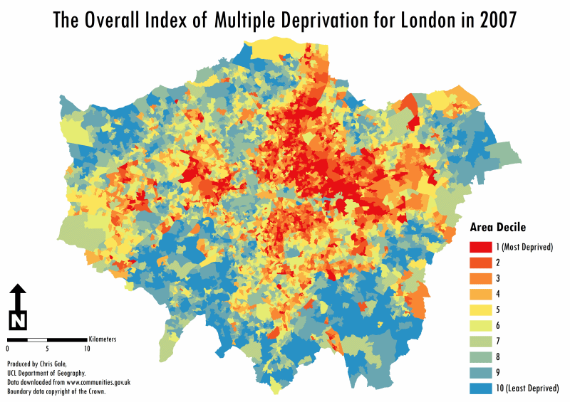
A possible reason why Barnet has on the whole has become “less deprived” is one of the seven indices used to create the overall index; Barriers to Housing Services Indice shows a marked change from 2007 to 2010. In 2007 Barnet is in the lowest deciles but in 2010 it is among the highest, jumping in some LSOAs 8 deciles. The Barriers to Housing Services Indice only has a 9.3% loading on the total IMD, but such a dramatic change is reflected, all be it not as dramatically in this map.
I also find it interesting how many times seemingly minor physical barriers crop up as major social barriers: it *looks* to me like you can follow the changing fortunes of Hackney by following the divergence on either side of the Lea. And I recall being able to see gentrification spreading under the Westway from the main North/South routes that cut under it in one of the earlier IMD data sets (will have to poke around to see if I can find that on a backup archive).
The areas surrounding the city of London (city fringes) are the ones experiencing the most dramatic gentrification. Outer London has overall, become more deprived due to more and more poorer tenants being displaced into places further afield (i.e. some suburbs).
In particular the areas which have endured the most rapid gentrification in inner London are parts of St. Pancras/Russell Square (once a highly deprived area) and parts of the South Bank (now a thriving tourist hub).