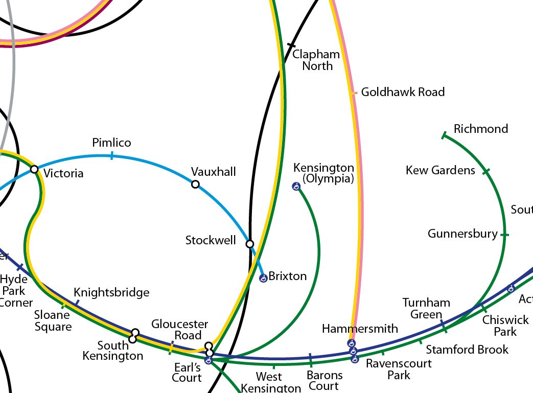
I’m a sucker for alternative maps of the London Underground, and here’s a great one by Francisco Dans (see the original in high-resolution on Flickr) – it’s perhaps not going to be useful to navigate by, but is a great bit of art.
A recent trend of alternative maps is to show geographically accurate ones, that inevitably end up crumpling the dense centre of the network and leave huge gaps on the edges. This is a map does the opposite – it has taken the geographical deformity of the underground network map to its (il)logical extreme. The real map has never pretended to correspond to the actual locations of the stations on the surface, placing stations in roughly correct locations, but only relative to each other and not the map as a whole. This does away with that rule too. But importantly, it is a topologically accurate map – the official connections are shown correctly. Everything else is curves of various radii – only the Underground logo and the station connectors are straight lines.
Francisco writes on his posting that he is looking to add in the DLR and Overground lines to a future iteration, plus fix a couple of bugs with the existing map that eagle-eyed observers have spotted. Hopefully the Thames will go in too, it’s the one non-tube feature that everyone loves. I wonder what that will end up looking like?
Thanks to Francisco for permission to reproduce the map and to IanVisits on Twitter for the heads-up.

