Back in August, one half of Mapping London went on holiday to New York City, and, after I got back, I wrote a few posts on classic maps of that other world city, including a recent remake of Vignelli’s fantastic (but locally controversial) 1972 Beck-esque map of the MTA Subway. Unlike Londoners, New York City dwellers never came to love the radically non-geographical map of their underground system, and the many bright colours – often along the same lines – may not have helped. The remake was a little calmer, and indeed a variant is used by the MTA for their weekend engineering works interactive map.
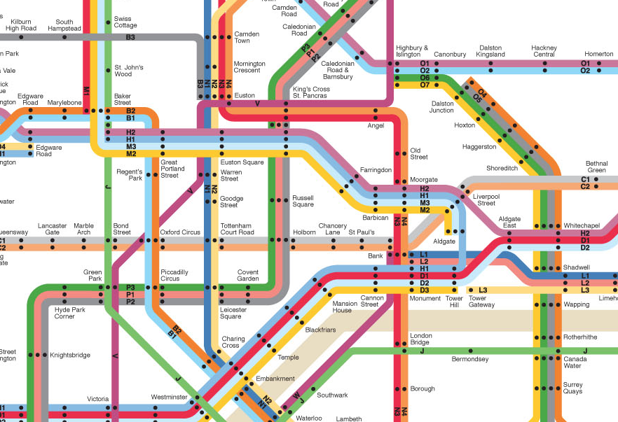
So I was delighted to discover this Vignelli-esque map for London by prolific designer Max Roberts (we’ve mentioned him before) which is the January “Map of the Month” in Max’s 2015 Calendar. Later on in the calendar, there’s four other original maps of the London network, along with seven of other cities. If you are a connoisseur of metro maps done right, the calendar is a bit of treat. Order right now if you want it for Christmas! Details here.
The geometry of the lines is largely similar to the official Beck map. However, the lines that have more than two normal destinations (e.g. the District Line) are normally split, with a line for each discreet service. Near the start/end of each line, there is a code, the letter representing the line (e.g. D) and a number indicating the service. So the District Line is shown with five different lines, braided together where they are common. The River Thames is shown as murky brown, just as the Hudson is in the New York City original.
Season’s Greetings from Mapping London! We look forward to bringing you more great maps in 2015, including perhaps the most famous London map of all. Until then, have a look at some of our older postings.
Thanks to Max for the review copy of the calendar. The image is from here, Max Roberts retains full copyright over it.
