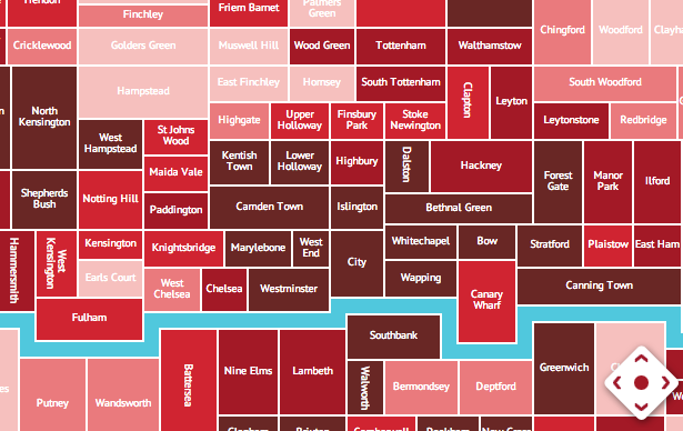
Rentonomy, who describe themselves as, for now, “an easy-to-use site that looks at London in a totally new way and gives you all the tools you need to find the right area for you”, have got some nice heatmaps of some London attributes, such as average rental values, crime rates (shown above) and average council tax. Each area consists of a few postcode sectors (e.g. E9 5xx, E9 6xx) grouped together, and is shown on the map as a simple rectangle in approximately the correct geographic position. The totemic river is also included – an essential for any London map – and that’s it. Simple but effective.
It’s similar to, but not quite, a cartogram map because the area of each rectangle is varied simply for aesthetic rather than quantitative reasons. Exact geographical boundary shapes are meaningless and unrecognisable to most people (except perhaps the Greater London Authority boundary) so doing away with them is no bad thing, while keeping the overall topological relationships between each area is also key.
They have also developed their own metrics for each area, such as transport accessibility, based on travel time from train/tube stations, the number of coffee shops and bars in an area, and so on. The demographics are presented in a clear, attractive format. Finally, they have a regularly updated blog with more interesting metrics and maps – such as which tubestations are busier at weekends than weekdays – another revealing metric for an area.
Screenshot, of crime rates, from the Rentonomy website.


Hi
How can I use or subscribe to your maps?
Hi
How can I use or subscribe to your maps?