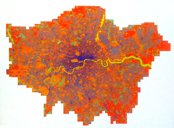
This map of mobile phone signal strength, produced by the GeoInformation Group this year, was one of the graphics featured in the exhibition that accompanied the launch of the London Mapping Festival at the beginning of June. The map, a raster at 5m resolution, shows how the mobile phone topography of London is affected by tall buildings, rivers and terrain. Its colours remind me of the Output Area Classification Map of demographics based largely on the 2001 census. It could be argued that a modern geodemographic classification these days might indeed take into account the availability and quality of mobile phone reception.
Other graphics in the exhibition included hand-drawn maps of people’s neighbourhoods and observations, the maps that are included on the Barclays Cycle Hire “miniliths” at each docking station, and some lovely old maps from the University of Cambridge Map Library. The exhibition will accompany some of the other events that take place over the next 18 months as part of the festival.
Copyright The GeoInformation Group Ltd, 2011. N.B. Apologies for the poor quality of the image, which was taken with my mobile phone at the exhibition. Unfortunately there was no key accompanying the map.


Hi Ollie,
Any idea where we could get a copy of this please? It looks awesome! Appreciate it was only taken on your mobile phone – still a good shot though! But we would love to know where to obtain a copy of it (if possible).
Many Thanks,
James
Hi James – have you tried asking the GeoInformation Group?
I’ve reviewed many fine maps produced by others, and GeoInformation Group just delivers the best quality images. No wonder it’s an aerial imagery provider to Google Earth.
Does this mean signal strength is weaker in central London where there are taller buildings/obstructions?