Mapping London Life is the title of the talk I gave at a great event organised by the Londonist and hosted by TAG Fine Arts. Surrounded by the wonderful maps in “The Art of Mapping” exhibition and speaking alongside John Kennedy and Stephen Walter the audience and I were in good company for 90 minutes of London map talk. For those who missed it I have included some of the slides, maps and videos that I talked about in my presentation. I have only been able to include those we have formally released so I am afraid one or two are missing.
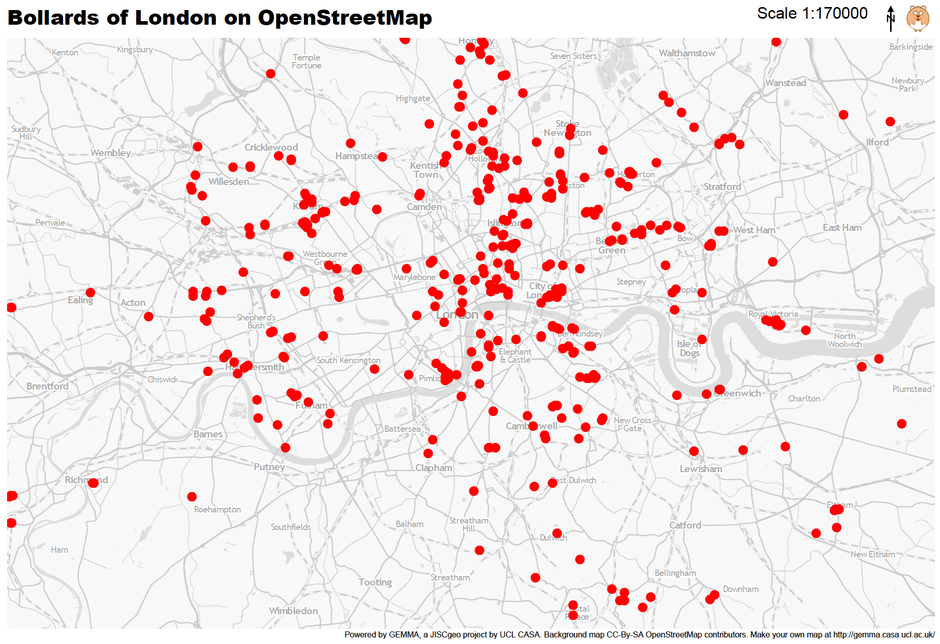
First up was a map of London Bollards. I used this to demonstrate that even though John Kennedy’s Bollards of London blog may seem a bit fanatical to you and I, he is not alone in his interests. All the bollards on the map below have been voluntarily mapped as part of the OpenStreetMap project. The map was produced using a great new tool called GEMMA (soon to be released) developed at CASA.

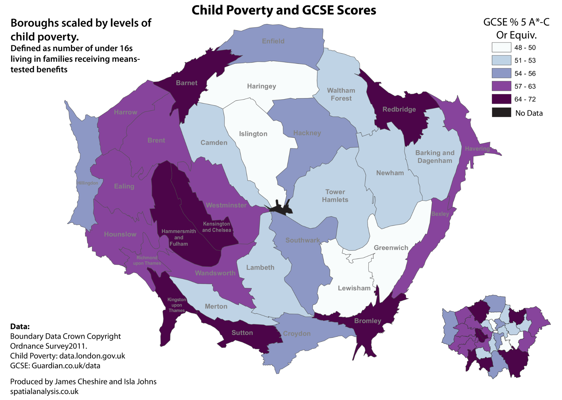
Next up I showed a couple of maps that demonstrate my personal interest in some of the social issues affecting Londoners. The first illustrates the great educational divide in the city. Each Borough has been scaled by the number of children who took GCSEs in 2010 and then coloured by their grades.
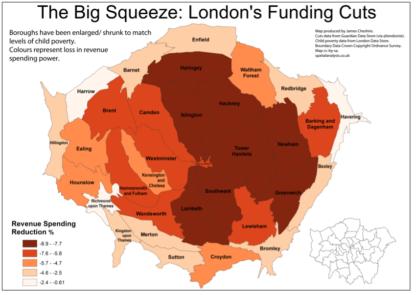
The map below shows a similar divide in the cuts to London Boroughs announced late last year. The Boroughs this time have been scaled by the number of children living in poverty.
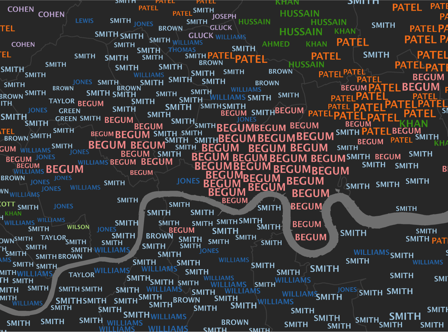
Next up were a couple of snapshots, featured in the Times Atlas of London, of the interactive map of London surnames I produced earlier this year. Click on the image to go to the map itself.
After this I moved on to some of the many great animations produced by fellow researchers at CASA. The first of these was Duncan Smith‘s map of London Urban form. One of the themes that Steven Walter referred to in his presentation was the idea of London as a polycentric city and Duncan’s visualisation clearly demonstrates this.
Next, I showed Joan Serras‘ map of London transport flows. This was a real favourite with the audience as it clearly shows London waking and sleeping.
The last two videos in the presentation focussed on a couple of things that are new to London. The first is Twitter. Every day more and more Londoners are tweeting and we can see some of their interactions in Anders Johansson‘s (and colleagues) video below. Geo located tweets are shown as yellow circles that fade away by time, and re-tweets are shown as small white points moving onto a line connecting the location of the original tweet and the geo location of the re-tweeter.
The final animation is of something close to our hearts and was produced by Martin Zaltz-Austwick and mappinglondon’s Oliver O’Brien. It shows the rush-hour activity of the Barclay’s Cycle Hire scheme during one of the last tube strikes. Each “cyclist” is coloured by the area they started in (top right is green, moving to red left-right and adding more blue up-down) so you can see how far they have travelled. Martin has a few more of these on his vimeo page.
I thoroughly enjoyed giving the presentation and talking with people afterwards. It is great to know there are so many fans of London maps and also some of the work we do at CASA.
If you want to learn how to do this stuff, we run a masters course at CASA and are already taking applications for next year. Click here for details.
Thanks for writing this up, James. It was an excellent talk. We’re still working on editing the audio, and this summary will be a very useful accompaniment.