The map is a cartogram showing the level of child poverty for each of London’s councils in addition to their predicted loss in revenue spending
More...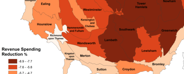
Highlighting the best London maps
The map is a cartogram showing the level of child poverty for each of London’s councils in addition to their predicted loss in revenue spending
More...