A series of blue cycle lanes, branded signs, junction reprofiles and street furniture changes are gradually being built, creating a “hub and spoke” type network
More...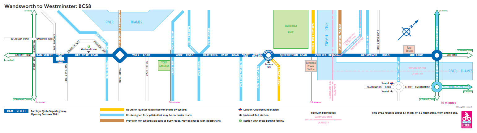
Highlighting the best London maps
A series of blue cycle lanes, branded signs, junction reprofiles and street furniture changes are gradually being built, creating a “hub and spoke” type network
More...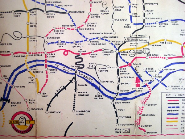
I wanted to steer clear of the iconic London Underground map because it is always featured on map blogs. I have already failed miserably thanks
More...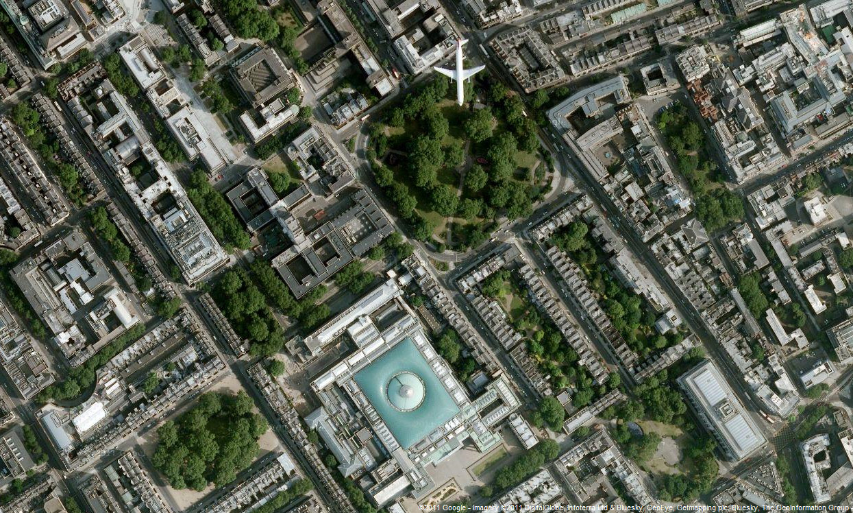
Google has updated the aerial photography available in Google Maps, for London. The new imagery appears to be from late summer 2010, showing the current
More...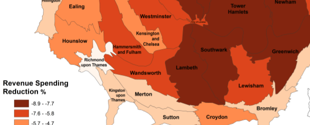
The map is a cartogram showing the level of child poverty for each of London’s councils in addition to their predicted loss in revenue spending
More...
Some of us at CASA can’t get enough of the Barclay’s Cycle Hire data. We have had Ollie‘s hugely successful flow maps, journeytime heat maps, and now the the Sociable Physicist himself,
More...
The Nike Grid was an Alternative Reality Game (ARG) for runners, held over two weeks on the streets of London late last year. After each
More...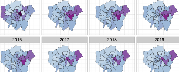
Buried in the London Datastore are the population estimates for each of the London Boroughs between 2001 – 2030. They predict a declining population for most
More...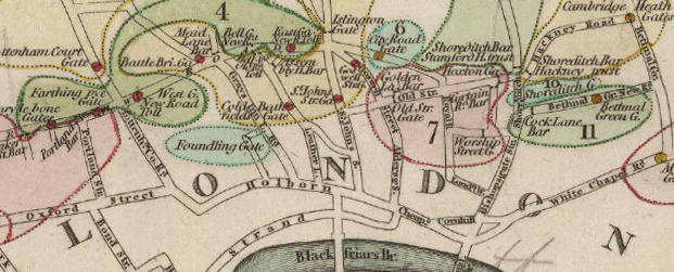
Paying to use London’s roads is not a new idea. I have just come across a map showing turnpike gates (tolls) which were like the
More...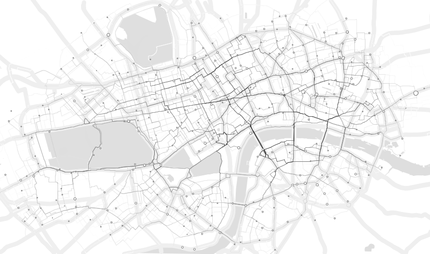
Demeter Sztanko has produced a stunning, minimalistic visualisation of the routes of the first 1.4 million Barclays Cycle Hire bikes. It is assumed that the
More...
Ollie O’Brien, one of the contributors to this blog, has produced a map, which updates in near-real-time, of the full/empty states of the 350-odd docking
More...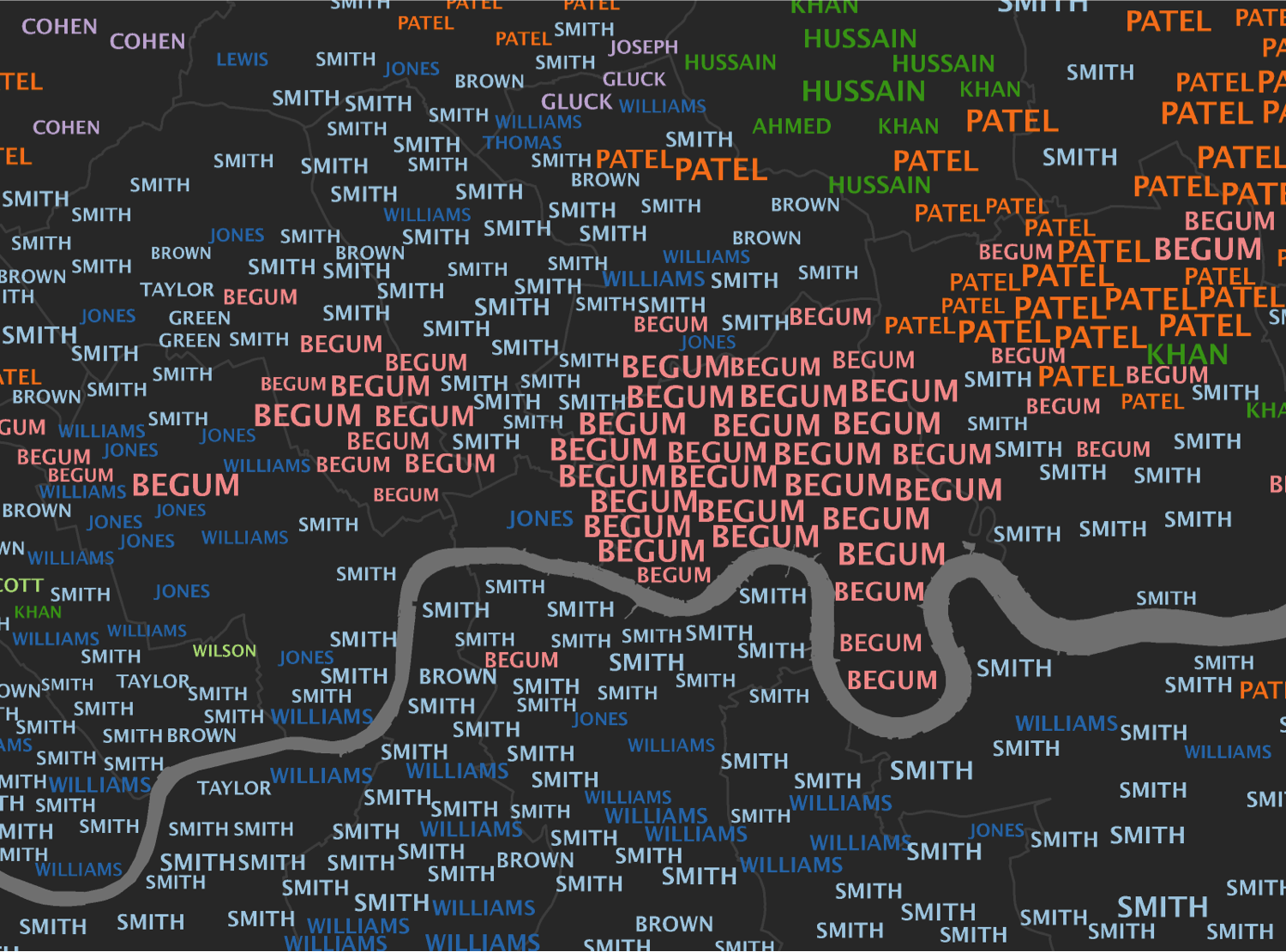
Inspired by the What’s in a Surname? map we helped make with the National Geographic, I have created 15 interactive typographic maps to show the most
More...